Color is one of the most powerful tools in interior design. It has the ability to set the tone of a room, influence the mood, and even affect the perception of space. Using the right color scheme can enhance the atmosphere of a room, making it feel welcoming, calm, or energetic, depending on your goals. In this article, we will explore the basics of color theory and provide a guide to help you create beautiful and harmonious color schemes for your home.
1. Understand the Basics of Color Theory
Before diving into specific color schemes, it’s important to understand the basics of color theory. Colors are divided into three main categories: primary, secondary, and tertiary colors. These categories are the foundation for creating harmonious color schemes.
- Primary colors: Red, yellow, and blue. These colors are the building blocks for all other colors.
- Secondary colors: Orange, green, and purple. These colors are created by mixing two primary colors together.
- Tertiary colors: Colors like red-orange, yellow-green, and blue-violet are formed by mixing a primary color with a secondary color.
Understanding how these colors interact with each other will help you create a balanced and visually appealing space.
2. Choose a Color Scheme
Once you understand the basic color categories, you can start selecting a color scheme for your space. There are several popular color schemes, each with its own unique look and feel.
Popular color schemes:
- Monochromatic: This scheme uses different shades, tints, and tones of the same color. A monochromatic color scheme creates a serene and cohesive look, as the colors are all from the same family.
- Analogous: This scheme uses colors that are next to each other on the color wheel, such as blue, blue-green, and green. Analogous color schemes are harmonious and create a calming effect in the room.
- Complementary: This scheme pairs colors that are opposite each other on the color wheel, such as red and green or blue and orange. Complementary color schemes create a high-contrast, vibrant look and are great for making a bold statement.
- Triadic: This scheme uses three evenly spaced colors on the color wheel, such as red, yellow, and blue. Triadic color schemes are vibrant and balanced, offering a playful yet harmonious feel.
- Split-complementary: This scheme involves using one color and two adjacent colors to its complementary color. For example, blue, yellow-orange, and red-orange. This creates a balanced but dynamic look with less intensity than a complementary color scheme.
3. Consider the Function of the Room
When selecting a color scheme for a room, it’s essential to consider the room’s function. The colors you choose should support the purpose of the space, whether it’s for relaxation, productivity, or socializing.
Color schemes for different rooms:
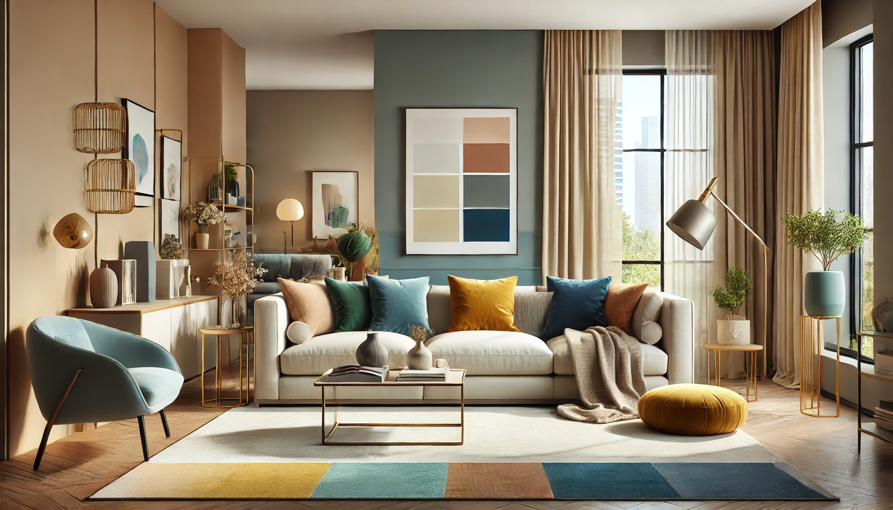
- Living room: Living rooms are spaces for socializing and relaxation, so warm, inviting colors work well. Consider shades of beige, taupe, and soft blues for a calm yet welcoming environment. You can also add accent colors like mustard yellow or rich burgundy to add warmth.
- Bedroom: Bedrooms should be calming and restful, so opt for cool colors like soft blues, greens, or lavender. These colors promote relaxation and are perfect for creating a peaceful sanctuary.
- Kitchen: Kitchens are high-energy spaces, so consider using bright, cheerful colors like yellow, orange, or light green. These colors can stimulate appetite and create an energetic atmosphere.
- Home office: For a home office, consider using neutral colors like gray, white, or beige with accents of blue or green. These colors promote focus and productivity without being too distracting.
4. Experiment with Accent Colors
While your primary color scheme sets the tone for the room, accent colors are key to adding personality and vibrancy. Accent colors can be used in smaller doses to highlight specific features or create contrast.
Ideas for accent colors:
- Bold hues: If your main color scheme is neutral, use bold accent colors like navy blue, mustard yellow, or deep red to add interest and make a statement.
- Soft tones: If your room features vibrant or deep colors, opt for soft accent colors like pastels or light neutrals to balance out the intensity of the primary colors.
- Metallics: Incorporating metallic colors like gold, silver, or copper in décor items (such as lamps, picture frames, or throw pillows) adds elegance and sophistication to the room.
5. Test Your Colors
Before committing to a color scheme, it’s important to test the colors in the room. Lighting plays a huge role in how colors appear, so it’s essential to see how the colors look in both natural and artificial light.
Tips for testing colors:
- Paint swatches: Use paint swatches to test the colors on your walls. Apply a small sample on different parts of the wall to see how the color looks in different lighting throughout the day.
- Start with a few accents: If you’re unsure about a color, start with smaller décor pieces like pillows, throws, or rugs. This allows you to experiment with the color without making a major commitment.
- Use virtual tools: There are many online tools and apps that allow you to upload a photo of your room and experiment with different color schemes virtually. This is a great way to visualize how colors will look before making a decision.
6. Create Flow Between Rooms
If you have an open floor plan or multiple rooms connected to one another, it’s important to create a sense of flow between spaces. Choose colors that complement each other across rooms to create a seamless transition.
Tips for creating flow:
- Use accent colors throughout the house: Use your accent colors consistently across rooms to tie the spaces together. For example, if you use a bold accent color like mustard yellow in the living room, use it in smaller accents in the dining room or hallway.
- Carry the main color scheme into adjacent rooms: If your living room is painted in soft blues and grays, continue those colors into the adjacent rooms for a smooth, cohesive feel.
Conclusion
Color is a powerful tool in home décor, and choosing the right color scheme can completely transform a room. By understanding color theory, considering the function of the room, experimenting with accent colors, and testing your options, you can create a harmonious and visually appealing space. Whether you prefer a calming monochromatic scheme or a bold complementary combination, the key is to use color thoughtfully to create the atmosphere you desire.